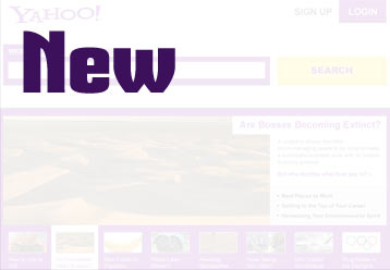
What Yahoo!’s Homepage Should Be Like
I used to use Yahoo all the time when Google still had the ugly interface that I just couldn’t stand to use, Yahoo even had auto complete for searches before Google did. Fortunately for Yahoo there is still a way to gain a bit more popularity, it just involves removing a lot of clutter and keeping the main elements of the home page (this is the biased part based on zero user testing).


Is there Room for One More?
One of the first things you notice on the homepage is the sheer number of elements that overwhelm you and it gets worse as you scroll down the page. The large number of links all over the place, especially the list of news headlines, makes it difficult and a chore to read through the page which makes the experience extremely boring and increasingly frustrating the more you try to sort through it. It would take several minutes just to go through all the headlines as there are so many, they’re so small (making it harder to read) and so scattered around the page, barely giving you time to focus on anything at all.
Repeat Repeat Repeat Repeat
While repeating elements on a page can be helpful to encourage certain actions and also help reinforce key points, it can easily make the page even more cluttered and overwhelming. Each news topic is a bullet point list stacked on top of each other, creating almost one long list that makes it unappealing, uninteresting and cumbersome to read through.
Importance is Definite absolute total Relative
 Creating a diverse news section such as on Yahoo is a challenge due to the diversity of the audience and their interests, to do it you would need to find out what is most important for Yahoo users from the news presented and make sure it is implemented well so that most of the time most users would find it interesting/useful.
One of the best parts (or maybe the only good part) for me is the news banner as Yahoo sometimes has quite interesting articles covering a range of topics, this is one feature I will keep in the redesign and make more prominent as it can present the most interesting articles from a variety of topics.
Breath of Fresh Air
I have kept the top part simple focusing on search and made the login signup obvious but not taking too much attention away from the search bar which uses yellow as an accent colour to show it is the main action to take on the page.


Those that follow financial news closely would likely go to Yahoo’s Finance sub-site or a site specialised in financial news rather than go through the headline list which can be applied to most if not all of the news topics. Removing the lists helps cut down on the clutter and helps present more interesting articles on the front page.
My redesign removes a lot of the clutter, the repeated elements and emphasises the important elements that got a little lost in the original design, creating a more enjoyable experience that can provide a nice blend of top news and search functionality on one page without overwhelming anyone.